Development Log 2 (Art Style)
Mechanic update
Upon player feedback, I got the impression that there was a slight lag spike when the player switched between each world and with this not only being the main mechanic, but also lacking the additional assets each scene would have, this was quite worrying. However, as I was speaking to my colleague who would be making the music for my game, he suggested having a break in between each switch. This would work where the game would pause for around one second once the user presses the shift key. This would not only solve the problem of having momentary lag, but also, this would help the player comprehend what they would be switching into.
Art Style Research
When doing research into my chosen art style of Pixel Art, I found that there was multiple different sub sections of styles within the pixel art bubble. The main two sub categories are isometric and non isometric pixel art. The stark contrast between the two is that isometric pixel-art gives the objects a ‘3D feel’
Isometric Pixel Art
As shown on the left, Isometric Pixel Art shows a lot more depth with it’s ‘3D’ look and is typically used in 2.5D games/animations. Arjan goes onto to say ‘Isometric projection is extensively used in older computer games and contemporary pixel art‘ this way ‘you don’t need to resize (read redraw) objects‘. Or, with the case of older game perspective, distortion doesn’t need to be calculated.
Non-isometric Pixel Art
However, with non-isometric Pixel Art, it looks a lot ‘flatter’ and is most commonly the one used in platformer games as Arjan goes onto state in his online tutorial, pixel art characters ‘Are most likely not drawn isometrically‘. However, one downside with this art style is that it can be quite time consuming.
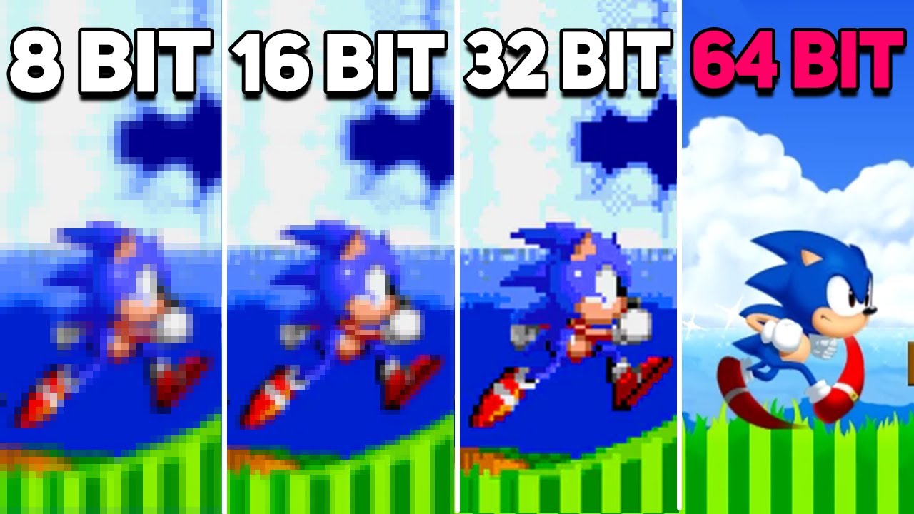
Another large decision I need to make with my art style is the number of pixels per tile I would like. As shown in the example above, the higher the pixels or ‘bits’ the more detail I can put into each tile. However, due to the fact that there’s more detail, this will undoubtedly take a much longer time to complete each tile set necessary for my game. I decided to do my own research and create a mock 16Bit tile as well as a 64Bit tile so I could understand which is it I wanted in my game.
Overall, I was quite conflicted with which option I should choose as each has its own advantages and disadvantages, with the 64Bit being highly detailed but very time-consuming, and the 16Bit being less detailed but easier and quicker to make. Due to the fact that I would inevitably have to create one tile set for each world, I felt a little apprehensive about choosing the 64bit as it would require a lot more work which I may not be able to complete within the given time frame. However, I feel that with enough dedication, I can get all the necessary assets completed.
16 Bit 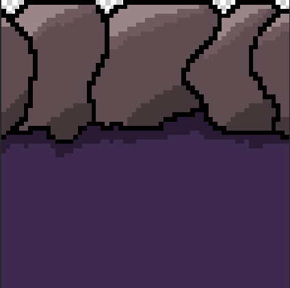
64Bit
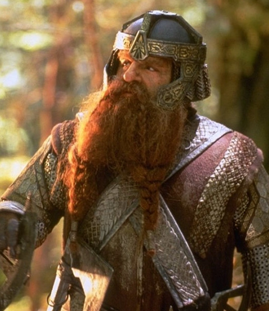
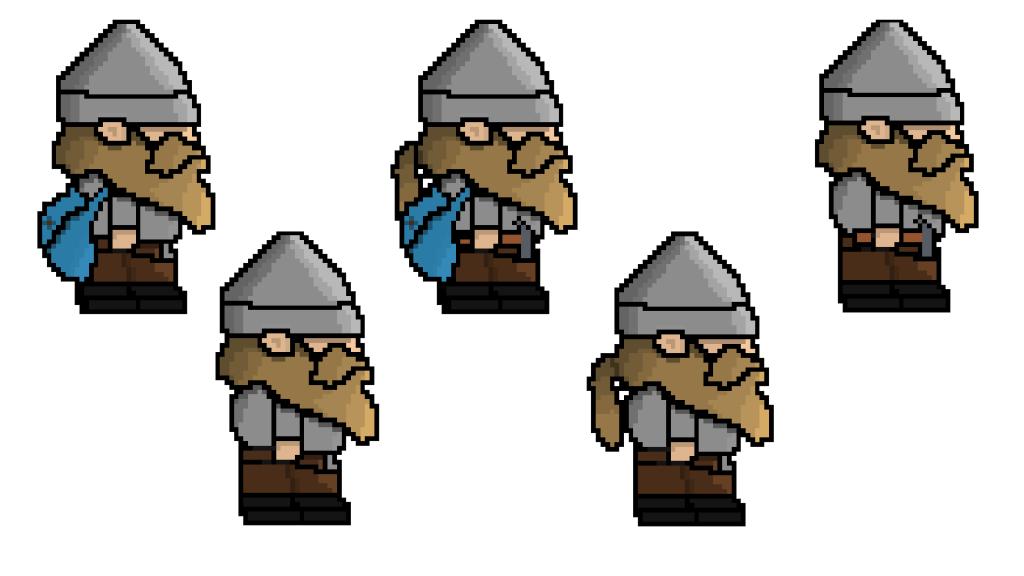
Once I had decided my pixel-art style and size, I decided to start designing one of my character, more specifically the smaller character in one of the worlds. I decided to make my character a dwarf as this would fit the description perfectly, and took most of my inspiration from the Lord of the rings character ‘Gimli’. As Gimli had an axe in the movie series which I wouldn’t need in the game, I decided to design a bag which would sit on the character back to give a little more detail. At first I designed a shield to sit on the character’s back but this wouldn’t be suitable as in this world, there is no fighting mechanic.
With that inspiration in mind, I decided to mock up a few different varieties of my first character which will be in the non-tainted universe and will be able to fit through smaller gaps. I decided to create a few variations of my character to decide which would be better to use in my game. In my opinion, I prefer the character with just the bag as too much more assets on the character would cause clutter and confusion for the player.

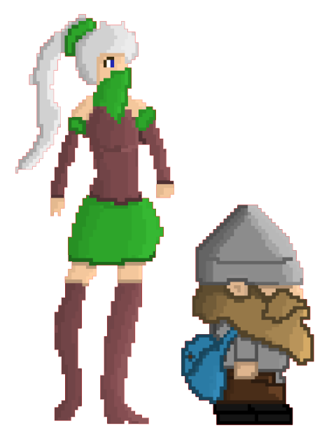
I then had to design a character for the other world, where the character is taller and can jump twice as high as the other character. I decided to head in the direction of designing an elven-style character and chose to choose a small colour palette of green, red, and white. WIth shading, I was happy with how the character came out but may add additional extras such as a bag, bow or another accessory.
During my design process, I accidentally removed the black background from my character, and with a little polishing to the edges, I was able to create a player character I was much more happy with as the black border added way too much contrast. The fact that this design looks more natural, I decided, as I wasn’t far into the design work of my game, I would go back to my first character and make this change on it as well. I will also be changing the legs and hands as they don’t work as well as they currently look. (The Red border will be removed prior to being put into my final game and is just to show where the character ends)
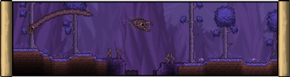
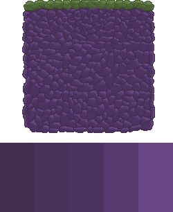
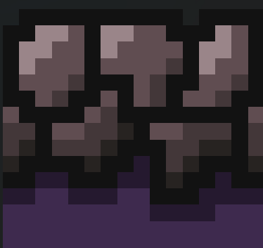
In keeping with the no-black borders, I started to design my first tileset which would be in the corrupt world. I took inspiration from the corruption from ‘Terraria’ which uses a colour palette of mostly purple and grey. The reason I chose to use the colour purple, is due to the fact that it is mostly depicted as a harmful, toxic colour that will give this effect on the corrupt world. I decided to add a moss layer on top as despite no plants growing in this world, moss and vines would still be invasive plants that would take over this planet.
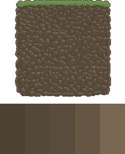
To create the standard world’s tileset I simply re-coloured the corrupt world’s tileset to a brown colour palette as this is seen as a neutral, soil colour that everyone recognises as being natural. For the walking platform on the top of the platforms, I attempted to create a grass layer as plants would grow in this world. Eventually, I will be creating assets to go into this world such as grass patches, trees, and other vegetation to populate this world.
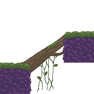
I then started to design a few assets which would tie the environment together. The first one I wanted to design was a fallen tree that bridged the gap between two platforms. However, this would only appear in one of the universes so the player would have to switch as the other character wouldn’t be able to jump the gap. I decided to use the existing colour palettes I have, toned down slightly into the greyer side as this will be in the corrupt universe so this will show the darkness of this universe.
With the main environment assets designed, I was ready to import this into Unity and begin updating my textures.
References
Terraria (2011) The Corruption [Image] Available online: https://terraria.fandom.com/wiki/The_Corruption
Arjan Westerdiep (2022) Pixel Art Isometric [Image] Available online: https://www.drububu.com/tutorial/#pixel-art-isometric
Group M Pro (2021) Sonic the Hedgehog 2 (1992) 8bit vs 16bit vs 32bit vs 64bit [Video] Available online: https://www.youtube.com/watch?v=64DOay5ZTSI