Design Process
Once we began our project which was to establish a 3D-Games company, I immediately began researching ways of creating an attractive yet professional company identity that appealed to viewers, whether it be employers or employees wanting to work for the company. A found Article by Jack Anto (2018) who talks about how responsive logos were ‘one of the most promising trends’ in early 2018 and was a growing similarity to newly designed logos.

This newfound information encouraged me to try to design a logo that was not only responsive to the size but also a shape that needs to be suitable for all circumstances. I also noticed a common theme among modern logos that had a colour palette of two colours and very rarely three colours, therefore, I decided to opt for the two main colours in my logo design process. I had a few colours in mind but eventually, I went with gold which is a colour I haven’t seen much in company identity and for that reason, I feel like our company identity will stand out against other’s.
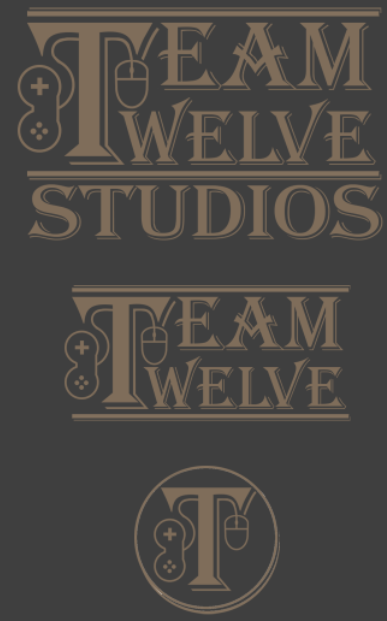
The reason for the simplistic design is mainly to mirror that same look on our company, making customers and other larger companies want to use our services. After feedback from outside sources, I learned that my old logo was too generic and had nothing in common with gaming. With the feedback in mind, I added two simple shapes which I hand drew, the controller and mouse connected to the T.
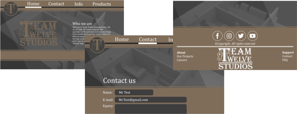
When designing the website, I made sure to keep the same two colour palette, while adding white which was necessary to make the text stand out. I wanted to make a contemporary yet practical design for the website which worked well with the logo I had designed
Anto, J (2018) Responsive Logo — Must Branding [Blog Post] Blog Thursday. 18 October. Available online: https://medium.com/@jackanto/responsive-logo-must-to-follow-4901cb0cfcbc [Accessed 08/04/2022]
Klyr, K (2018) Logo Trends [Picture] Available online: https://www.pinterest.com/pin/566257353142511553/ [Accessed] 08/04/2022]